
Pinqponq
User Interface
HCI
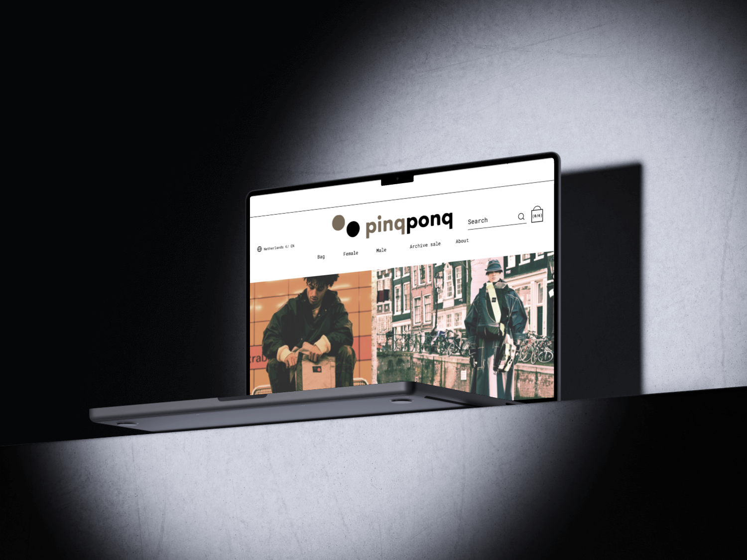
Pinqponq
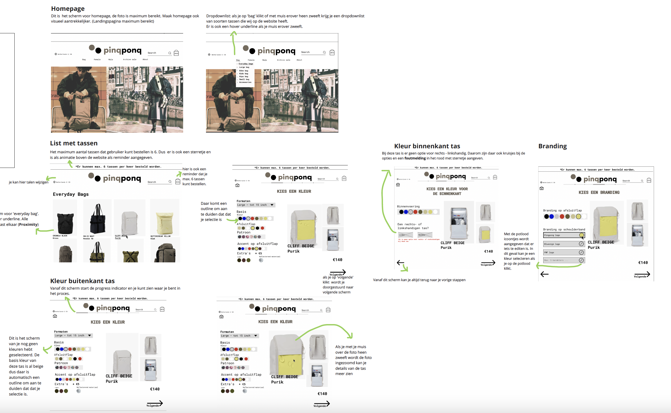
The assignment was to make the existing Pinqpong website more user-friendly and clear. The goal was to simplify the ordering process and give the website a professional and attractive look. I did this by adding improvements like a progress bar, clear navigation, and interactive features.
Key Design Elements:
- Metaphor: Using a shopping bag as the cart icon instead of a traditional cart. This matches Pinqpong’s visual style and gives a more professional look.
- Forgiving Format: Users can go back a step on any screen without restarting. For example, from the "CHOOSE A COLOR" screen, they can return to previous selections.
- Feed Forward: Icons clearly indicate their function. Clicking a pencil icon allows users to edit their choices.
- Progress Indicator: A progress bar shows users where they are in the process, from selection to payment.
- Responsive Interaction: Features like zooming in on a product image when hovering, showing a dropdown list on mouse-over, and clear error messages for missing information.
What I Learned:
Through this assignment, I realized how important it is to make a website simple and clear for users. When everything is structured logically, people can navigate without trouble. I saw how a progress bar helps users understand their position in the process, making ordering smoother.
I also learned that small details, like error messages or an easy way to edit choices, make a big difference. By using feedback, I improved my design and made it work even better. It was interesting to see how small changes, like a hover effect or a pencil icon, can make the experience much easier and more enjoyable.
