
Marktfinder
User Interface
Link to notion: https://www.notion.so/MarktFinder-18bdd078db2d80da8a26f42cdae4d9e1?pvs=4
Designing Marktfinder
While designing Marktfinder, I focused on making the app clear, easy to use, and inspiring. The app helps travelers and market lovers not only find markets but also enjoy discovering new places.
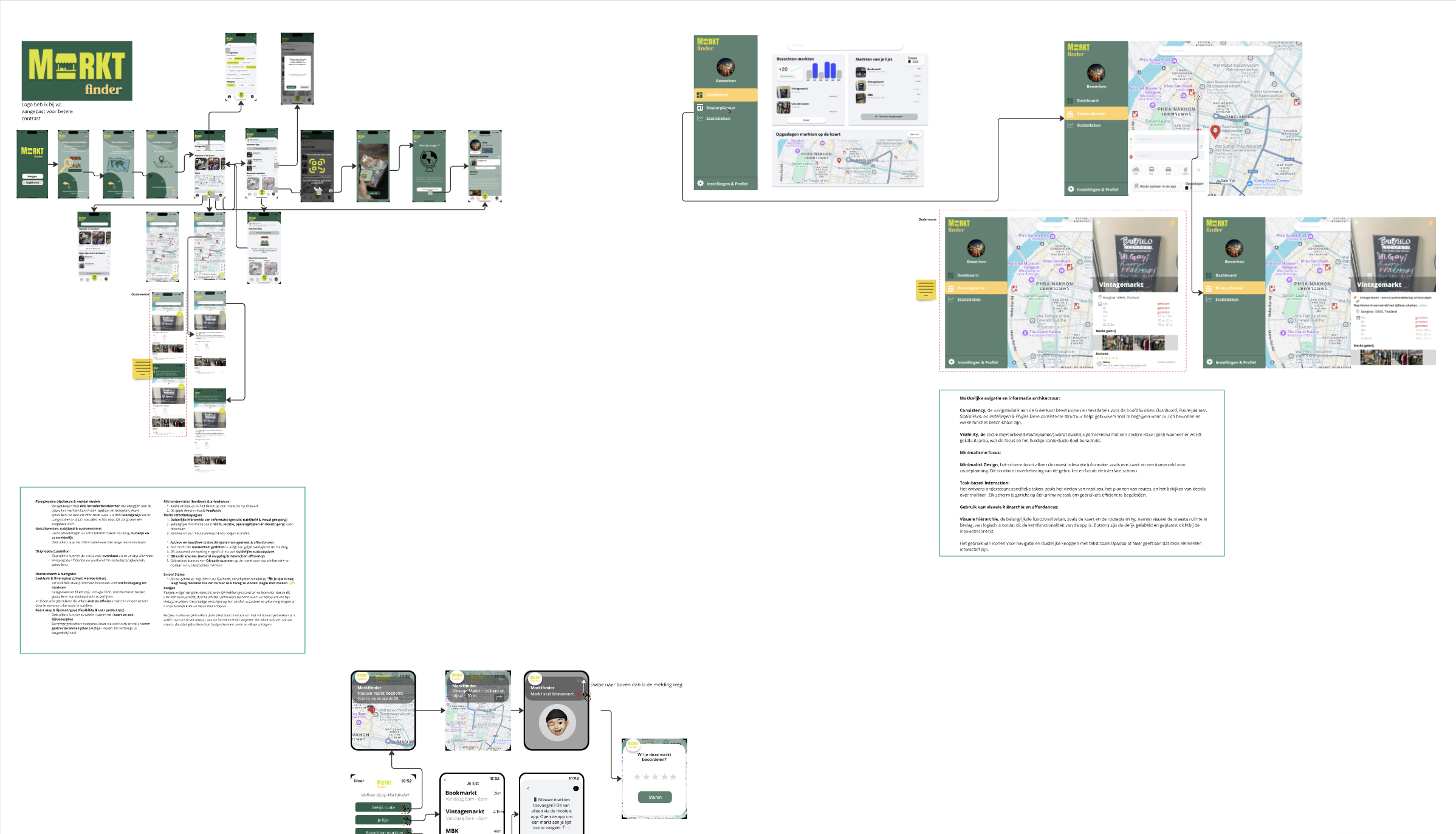
Structure
The app has a simple and organized layout so users can quickly find what they need.
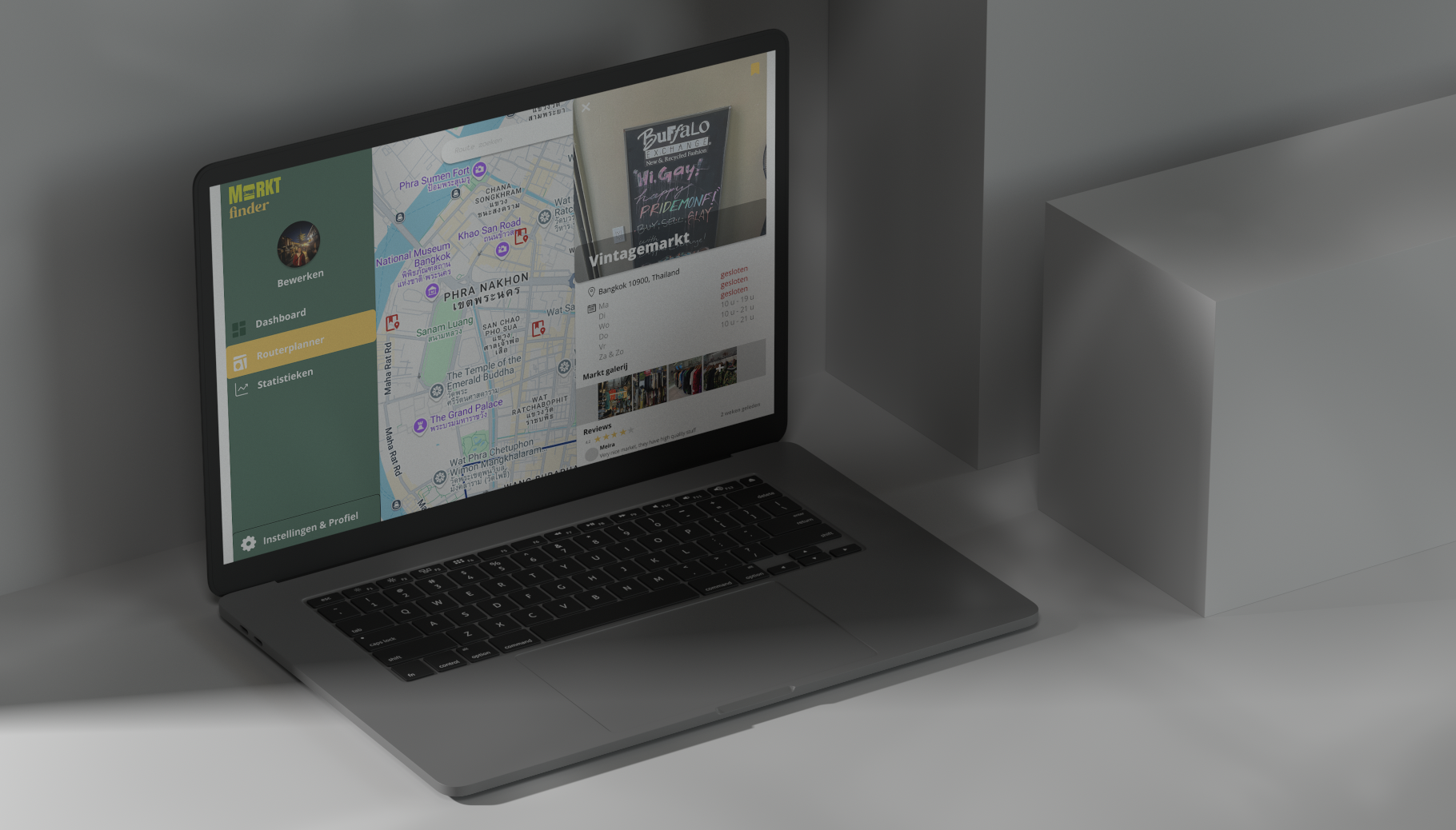
- Home → Shows nearby markets and recommendations based on preferences.
- Map → Works like Google Maps, making it easy to navigate and find the best markets.
- Familiar buttons and gestures → A plus button to save markets, swipe actions for quick interactions, and useful search filters.
Style & Design
I used Google Material Design (m3.material.io) for a modern and familiar look.
- Colors → Warm tones like earth colors, yellows, and greens to match the lively market atmosphere.
- Typography → Playful yet readable fonts for easy scanning.
- Icons → Clear icons for navigation and actions, making everything instantly understandable.
Extra Features
For added fun, I took inspiration from Strava and Pinterest.
- Badges & Stats → Track visited markets and earn badges like "Street Food Expert" or "Vintage Hunter."
- Community & Reviews → Like Pinterest, users can rate markets, share photos, and leave tips.
- Smartwatch Support → Quickly check visited markets and get notifications about new ones nearby.
This design makes exploring markets easy, fun, and engaging. With a clear layout, vibrant colors, and playful extras, the app feels both familiar and enjoyable to use. It’s more than just a guide—it’s a way to track and share your market experiences!
